Digital Font Work
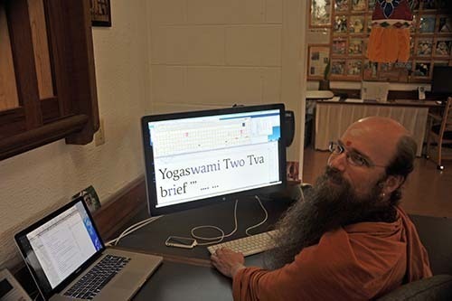
This phase our book team is making some improvements to the font being used for The Guru Chronicles. The font, called Relato, was crafted by Spanish type designer Eduardo Manso. Back in 2008 we went searching for a special font in which to typeset this special book. We found Relato on a type foundry’s website and obtained permission from Eduardo to add diacritical marks for the transliteration of Sanskrit words. The Hinduism Today team decided to use the font for the magazine starting in 2009, well before the book was to be printed, and it has been a great success. Today we are making some improvements to the kerning table in the font. Kerning is the relative space between specific pairs of letters, and it is a crucial aspect of refined typography. For example, the pair Yo, if not kerned properly, will have the o starting at the right-most point of the Y, leaving an ugly, disproportionate space to the left of the o. When properly kerned, a negative value is given between the two glyphs so that the o will tuck nicely underneath the right branch of the Y. Other pairs that we are examining today include ie and Tw, as well as the ellipsis and period. All you type nerds out there, rejoice!
From Our Gurus' Teachings
Archives are now available through 2001. Light colored days have no posts. 1998-2001 coming later.
